Scroll Down
Scroll Down
Scroll Down
Bringing road infrastructure up-to-date
NoTraffic is a startup dedicated to solve one of the most common (and annoying!) problems in our planet, traffic. In order to do so, NoTraffic is bringing the road infrastructure up-to-date by developing the first AI-powered traffic signal platform that connects road users to the city grid, solving today’s traffic challenges while unlocking smart mobility benefits for the cities, and creating an entirely new way of life.
ROLE
Visual Identity
Product Design
COMPANY
NoTraffic
“We had a lot of ideas and a lot of possibilities, Alan was able to put everything together quickly in a way that our customers love to use.”
Uriel Katz. CTO and founder, NoTraffic
The challenge
I was from the very beginning with NoTraffic, being the only creative power in the house. I had 2 main challenges:
Create the visual identity from scratch.
Product Design (UX and UI) of the system that will be the costumer facing tool to manage the traffic.
Insights
The only insights I had was what at the time, the 2 founders could gave me. We knew that we wanted to target municipalities, while bringing them to a new level of experience from what they knew until then.
Municipalities worked with very rusty and outdated systems (sadly a can’t put some samples here), while also being unable to flexibly control, manage and be aware of the traffic situation in their cities.
We wanted NoTraffic to be a game-changer, not only in traffic management, but also, in how municipalities manage traffic.
The Solution
Creating a “game-changer” from scratch, alone, is not an easy task. Having at least some insights on our target audience helped, a lot. I created a solution for each of the tasks, Visual Identity and Product Design. Taking on account that Product design can’t start without having a clear definition of the Visual Identity I went to work.
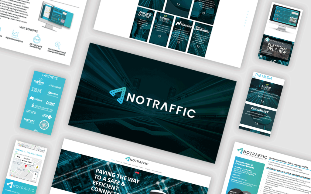
Visual identity
For the visual identity I went for a techy but simple look. We wanted to convey a cutting-edge system which will improve the life of all the population while being accurate and straight forward with the message that this is about roads, about infrastructure.
TYPOGRAPHY

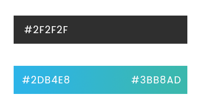
COLORS
Product design
In order to get the architecture defined as accurate as I can, I focused on the main features we can deliver and believe are of importance for our target audience.
We decided to move forward with our hypothesis and start an iterative agile process to refine and re-define the system.
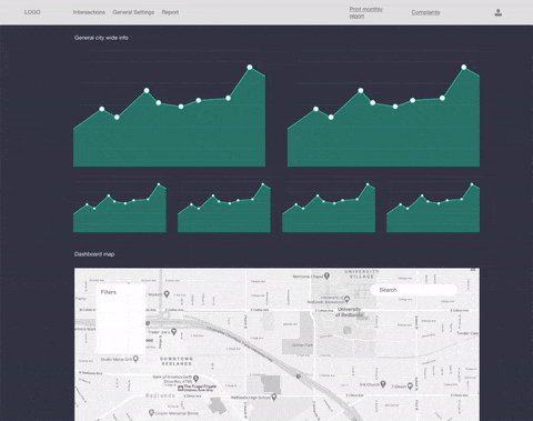
Tinkered and twitched the components of my wireframe until I got to a result we can move forward with to present as a first draft.
After I collected the pain points of our clients via wireframe iterations I was able to refine it as accurate as possible. I landed on an approach that had a map as the main component, with side navigation that offered a lot of space for future features development.
My partners were happy, it was time to get to work on the interface (yay!).
Today
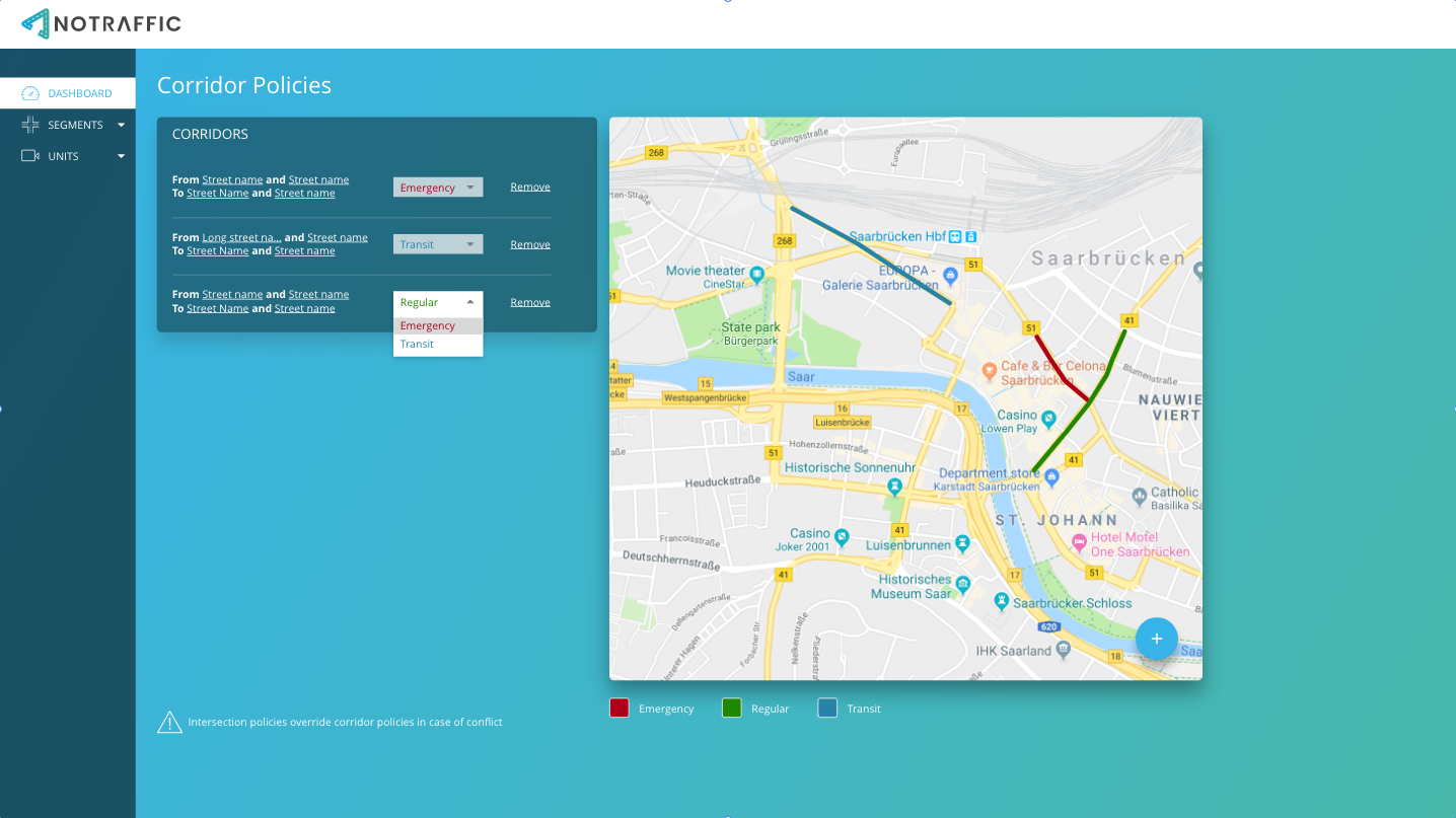
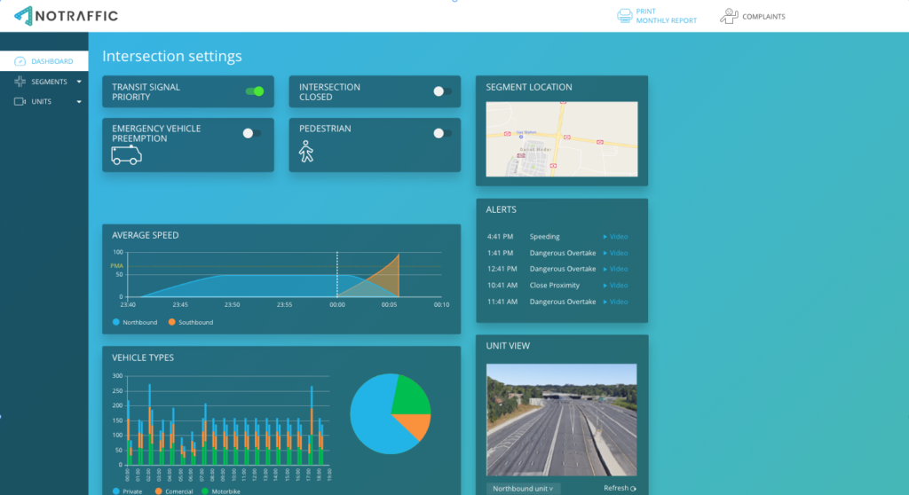
We’ve been really busy adding several features and modules to the system like corridor configuration, intersection settings and more. This due to a deep understanding of how agile methodology works not only from my side, but from my partners at NoTraffic also.

Today, NoTraffic was featured in ABC news, NBC News, Fox News and more haven won several prizes like the M2 Miami Mobility Challenge.